
THE SCIENCE BEHIND A
BRAND LOGO
There are MANY articles, tutorials, books, whole courses, about what is behind a “good logo“.
So I’m just going to share here a compendium of a lot of what others have already written about, and add to it my own knowledge and experience. It’s said that knowledge and invention are just the results of exactly that: the process of bringing together things from various sources and thus “creating” a result from that.
My intention, is to help with my own grain of sand, with each of the categories in this portfolio, to help out fellow designers who are in the process of learning about the different areas in our field of work, as well as other people who are looking to fulfill their own needs regarding design services, and information like this can help them make a more informed decision.
First of all, let’s talk about the different type of components/parts that can integrate or be the defining symbol/text for a “logo”, or Brand Representation.
Hover your cursor over each one for a definition:
- logotype.
- isotype.
- IMAGOTYPE.
- isologotype.
- MONOGRAM LOGO.
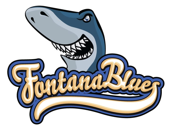
So, we have looked at the different type of compositions a “logo” can have. Some can be considered variations and could be part of a more complete Brand Identity. I think the IMAGOTYPE is the most flexible and complete of the list, and the iconographic/image part of it can even be some sort of Monogram. The variations could be, taking it apart, versions for black and white and color applications, for a vertical and horizontal format s(depending on aspect ratio of the canvas), etc.
That’s all relating to implementation…
But, on what are we basing our design?
That is the most important question we have to ask. And it should be answered by a whole questionnaire we should give to our customer to fill out.
Download it here ↓
This downloadable questionnaire is to give to your customer and should be considered as JUST A GUIDE.I myself have taken guidance from others that share their insights on the web.
It’s not by any means a definitive list, and most certainly, you can pick and chose the questions you feel WILL apply to the specific customer and project you could be working on. If you are someone looking to get some work done for your Brand Identity, you can also take a look at this, and arrive fully prepared to meet with whomever you are going to get the work done. Believe me, it will push the project along nicely and give it a great starting point.
Once we have all those answers, it’s time to start condensing all the abstract information into graphic representations.
The more complete the list of requirements, the easier it becomes to know the limitations and preferences that should be followed, like the style, colors, focus, etc.
The process can then begin with some sketches. Honestly, I suggest going to pencil and paper. Sit down with your answered questionnaire and then start sketching freely. Clear your mind of anything else, and let it go. This first stage can produce interesting approaches. I highly recommend staying away from Google! You don’t just want to clone something someone else did, do you? It would completely go against the process you started: An unique solution to a unique case.
Once you have done some sketching (including fonts, etc), go through those sketches, and curate what you like best.
Leave that on the table, and THEN do some Googling into what the competition is doing, or look for logo styles that fit your vision, which is based on what you learned from your customer.
Then look back at your sketches. Do any of them work as a good start?
If not, go back to the drawing board, literally. Why do I recommend a pencil and paper?
This is a lost part of what most designers do nowadays. Most just find a font they like, then slightly modify it, and add some generic or abstract symbol next to it, and call it a logo.
If you try and work with your hands first, you can bring your own unique vision into the process, and the result will be a lot richer from it.
As I said, these are all just suggestions. In the end, there are many approaches that designers can take to provide their customers with the branding solutions they need.
Just remember to take it as seriously as it requires to be.
After all, this is the foundation on which all branding and marketing will be based upon for your client, make sure, you give them the best start possible!
P.S. If you ever wonder HOW MUCH you can charge for a FREELANCE project like this, make sure you check out my “Project Budget Calculator“, it might give you at least, a reference as to how to best calculate the value of your work.