MULTIPRO CR – DESIGN PORFOLIO BY OSCAR BLANCO

FREE STUFF!
Make sure to visit "TOOLS & STUFF" under the ABOUT menu item, to visit my BLOG, where you will find things like a Project Budget Calculator automated form, as well as resources to download (3d models, cliparts, etc).
Oscar Blanco.
Heredia, Costa Rica
OscarMultipro (Skype)
I would love it if you stop by to say "hi", or "thanks" (if you have use for any of the free stuff), or simply follow me on my Social Media platforms.
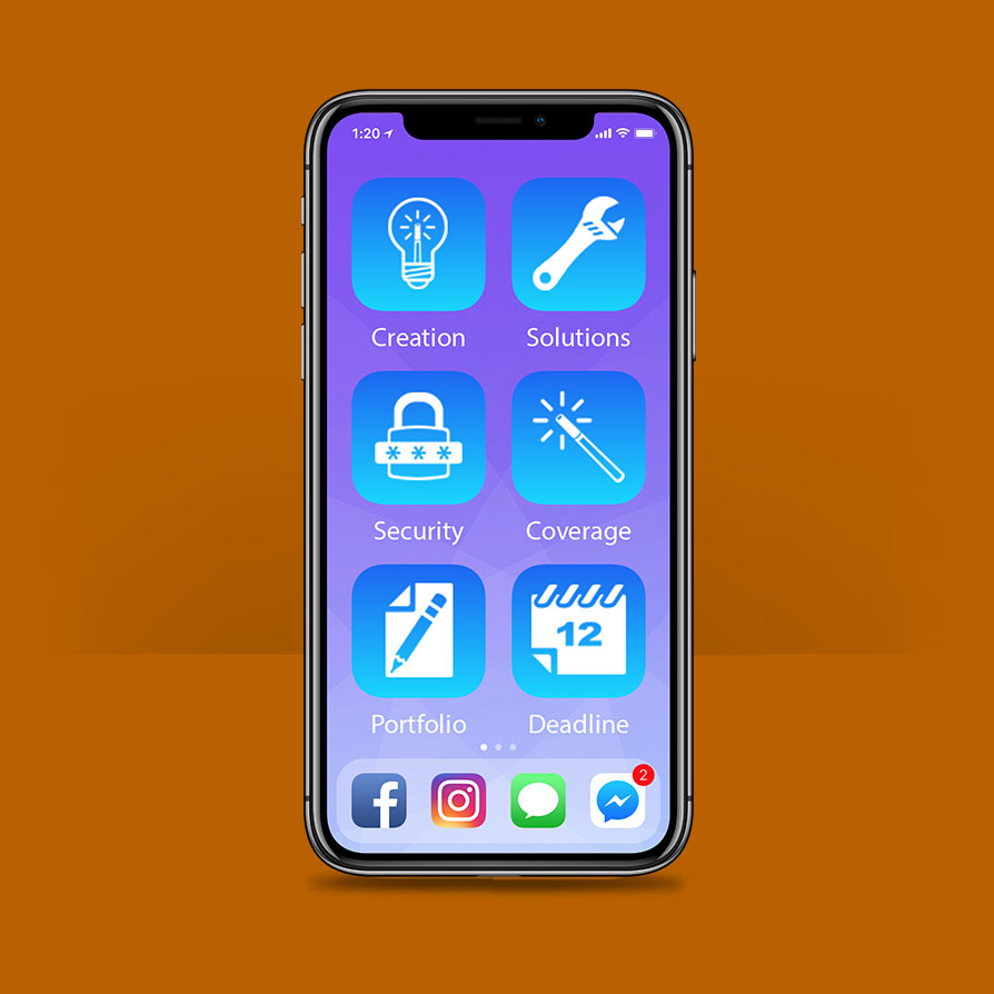


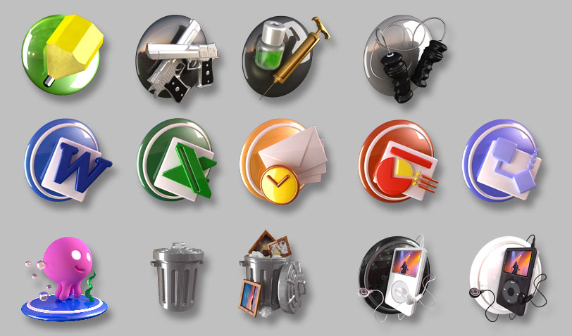

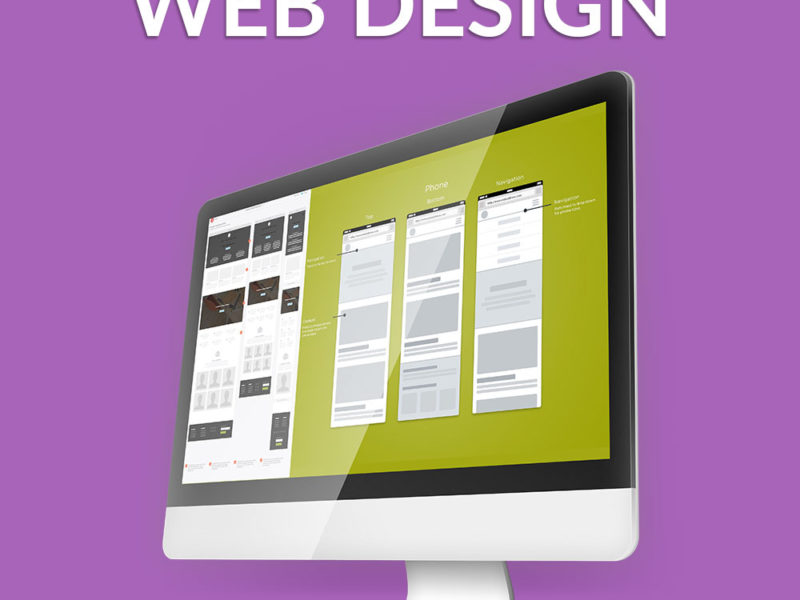
ICON DESIGN
This is an example of an animated SVG icon.
EFFECTIVE COMMUNICATION BY
ICONOGRAPHY
Originally, the use of icons in graphic communications was mostly related to signposting, road signs, etc. Their purpose was to either guide, warn or limit “users”, by successfully synthesizing visually in a very simple concentrated representation, a job, place, abstract concept, message, possible danger, or other things relating with helping guide people through or to some particular destination.
In a way, icons and their application in the digital world are still accomplishing the same function. They are used to guide people in the use of an interface, belonging to an application or operating system, to enable them to use it, by finding the tools or sections they need to access. A destination.
Remember, this is something so important, that Steve Jobs is said to have obsessed over accomplishing the perfect icon, from both the aesthetic and functional aspects that an icon should effectively represent.
Now, even though aesthetics are very subjective, they are certainly influenced by trends, but most importantly, the tone, the style, and last but not least, the required visual cues that will clearly speak to the targeted users. Being appealing for an icon is certainly a plus. But most of all, it’s about being very clear, with very well defined lines, color harmony and contrast to stand out and pull the user’s eyes towards it.
It’s also important to mention, that it’s not the same to design icons for an accounting or word processing application than for a game. Even within a genre, there are many approaches that can be taken to summarize a graphical abstraction of an action, or accessing an area within an application. For instance, when it comes to games, there are many variations in visual styles, determined by user ages, game categories (FPS’s, RPG’s, Puzzles, Adventures, Simulations, Strategy, etc), and many other characteristics.
Icons can go from the flat minimalistic look that the latest iterations of iOS helped reinforce, and even start the trend of “Flat Design” half a decade ago, to completely realistic representations of a thing, animal, place, or person.
Preferably icons should be approached in much the same way as other Brand elements like a “logo“. There should be a thought process behind it, a very thorough process, which will help determine just how effective an icon can be in accomplishing its determined tasks.
Finally, icons normally come in COLLECTIONS, so that means you have to create a whole group of icons that have to work together. In much the same way as when creating a Brand Book/Kit/Guide, you have to make sure that there is CONSISTENCY in whatever you develop graphically. That’s sometimes a difficult task because some concepts are much harder to simplify into a basic shape than others. So that may mean some icons look more complex in shape than others. But you still have to make sure, that they make sense as a whole. Like making sure all the links on a website (of a certain type, since there are text links, buttons, etc) have the same color/style. It’s about USABILITY. I never forget something I read at the early stages of the internet, when I first heard about Usability: “You have to design, keeping a mindset, that users are stupid“.
Now, of course, this sounds crass and insulting. But the idea behind this is that users, when they first arrive at your application, your operating system, your game, etc. They are ignorant of HOW to use it. There is a LEARNING CURVE for ANY application/system/etc. Even ones that we assume will be outright intuitive, are not. It can be from things like a user who is completely inexperienced with digital media, maybe they have never even used a computer. This includes children and the elderly. Or it could be because of any other list of reasons. You cannot assume a user will know immediately what you mean by a visual cue. Your call to action through an icon must be as clear as possible, and yes, you can cheat and use already existing legacy iconography, that is well imprinted into the collective subconscious. Although, some of them are extremely dated when it comes to the digital world.
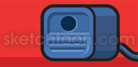
For instance, iconographic representations like these, are STILL being used in many websites, apps, and operating systems:
![]()
Most young users have no idea what the first and third icons represent. Not even having seen or heard of a diskette, or a rotary phone for a landline. The envelope might be a possibility, since mail still arrives at homes from banks, marketers, etc. But there’s almost a certain possibility that they haven’t ever mailed someone a letter using a postal service.
Funny how things change, but can stay the same.
Representing something with a visual abstraction that has no meaning to users, demonstrates that once a user LEARNS to work with an application, the icon’s figurative representation no longer matters. Users will know that the little square thingy is for saving a file. But why it has that shape? They probably only wondered about it for a few seconds until they LEARNED what it’s intended function was. And then, when present in another application, they didn’t even give it a second thought.
The same goes for other icons like the Copy and Paste icons (clipboards), the zoom icon (magnifying glass), the outdated TV icon with “bunny ears” (antennas, back from when you got your tv channels “wirelessly” hehe), and so forth.
Anyway, my point with all of this is that a GREAT icon, has to have both: AESTHETICS and CLEAR FUNCTION. These outdated, and now obscure and even mysterious icons (to new generations) are still being used, even though what they represent graphically is an unknown to those young users, and they are being used because at their creation they were the accomplishment of having everything a great icon should have. To the point, that replacing them can even confuse users. For instance, a USB drive should be able to replace the diskette by now, and it probably would, but you have to deal with the user learning curve. And a lot of application creators don’t want to have to deal with angry customers calling in to ask such basic things as to just how the hell they can save their work on their application.
Ultimately, things WILL change, concepts fade out and are replaced.
And part of that process is the work us designers strive to accomplish. It’s about communication, guiding users, so they can reach their final destination, in much the same way as road signs, and signposting started out doing decades ago.
P.S. If you ever wonder HOW MUCH you can charge for a FREELANCE project like this, make sure you check out my “Project Budget Calculator“, it might give you at least, a reference as to how to best calculate the value of your work.
CONTACT ME
Artist:
Oscar Blanco.
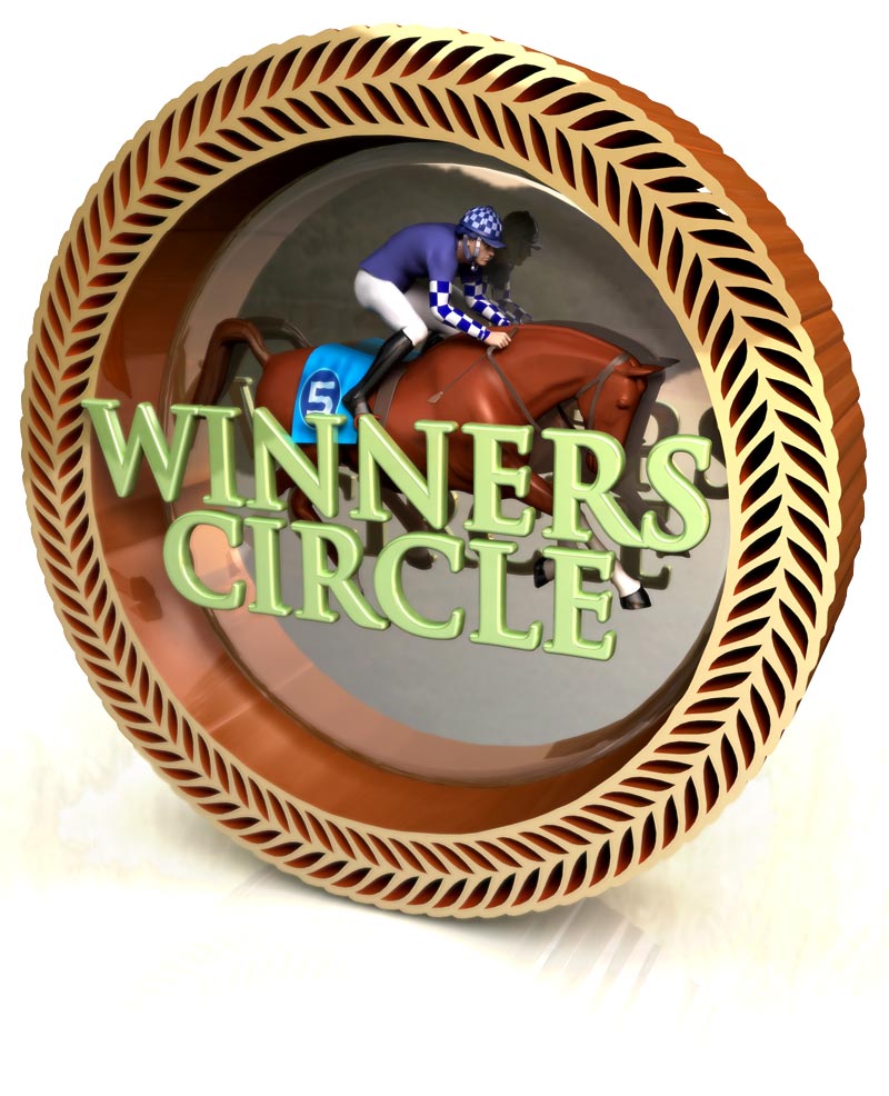
Project:
Various.
Category:
Branding, icon design, Logo Design